How to Make Your Home Look Expensive Using Paint Colors and Wall Finishes
Expensive paint colors and wall finishes can instantly transform a home, making it look refined and luxurious without major renovations. Choosing the right shades, textures, and finishes enhances space, light, and overall design. By avoiding common wall decor mistakes to avoid , homeowners can create cohesive, high-end interiors. At HomeChisel, we guide you in selecting finishes and colors that elevate your rooms while reflecting your personal style.
Table of Contents
Why Paint and Wall Finishes Matter for a Luxury Look
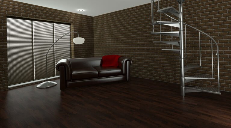
Paint and wall finishes shape how your home feels the moment someone walks in. Color directly affects how large or small a space appears. Light shades reflect more light and make rooms feel open and airy. Deeper tones add depth and create intimacy. The right color can visually raise ceilings, widen narrow walls, and balance uneven layouts.
Finish quality also plays a significant role. Smooth application, clean edges, and the right sheen level give walls a refined appearance. Matte finishes soften light, while satin or eggshell finishes add subtle depth. Texture, such as plaster or limewash, introduces character and dimension.
Together, color and finish set the tone for the entire space. They influence first impressions and determine whether a room feels polished, cohesive, and thoughtfully designed.
Choosing Expensive Paint Colors
The best paint colors for a high-end look are intentional, balanced, and coordinated with the room’s architecture and lighting. Using the right tones helps expand space visually, create focus, and establish a sense of cohesion throughout the home.
Rich Neutrals and Toned-Down Hues
Warm greige, muted taupe, and soft mushroom tones are timeless choices for creating a refined atmosphere. These neutrals work in virtually every room because they adapt to both light and shadow, making spaces feel larger and inviting. When applied even with attention to finish quality, these shades reduce harsh contrasts and instantly elevate a room, providing a subtle luxury that is both calming and versatile.
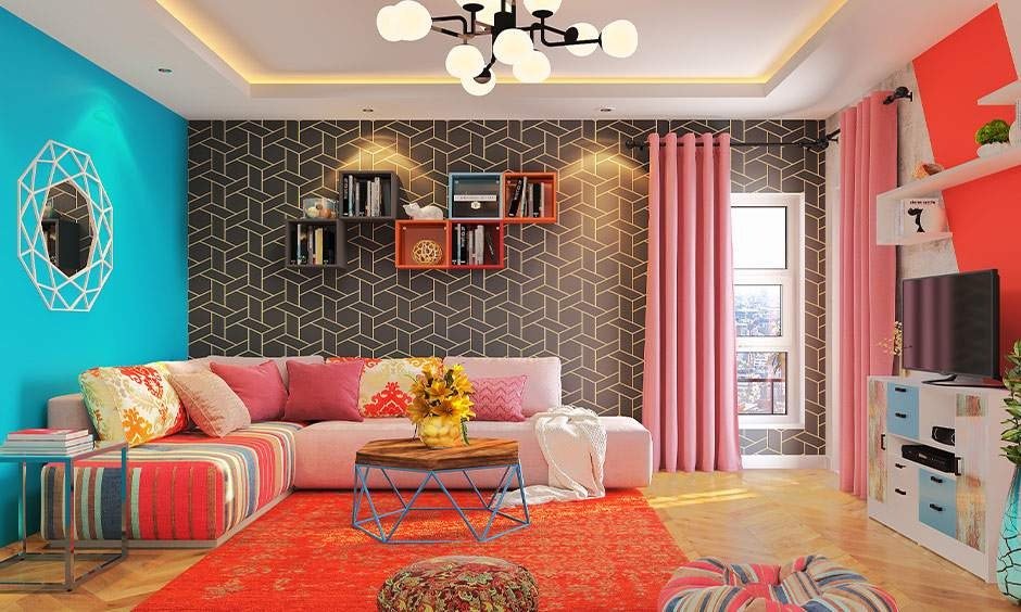
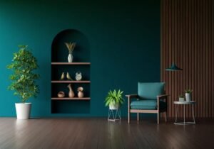
Jewel Tones as Accent Colors
Deep navy, emerald green, and muted burgundy offer a sophisticated punch when used as accent walls or design highlights. Jewel tones add depth without overwhelming the space, especially when paired with complementary neutrals. Proper placement and lighting are essential: use them on smaller walls, niches, or panels to create visual interest and highlight upscale wall finish techniques, while keeping the overall space balanced and harmonious.
Crisp Whites and Off-Whites
Crisp whites and soft off-whites are classic choices that feel clean and luxurious when done correctly. Undertones are critical: ivory, cream, or warm whites prevent cold or sterile appearances. Paired with polished finishes like satin or eggshell, these shades enhance natural light, define architectural details, and provide a high-end backdrop for furniture and decor. Clean lines and proper prep work are key to achieving the luxury look.
Coordinating Color with Room Function
Matching paint to the room’s purpose ensures both style and comfort. Bedrooms thrive with calming wall colors, while living areas support slightly warmer, richer tones to encourage social interaction. Coordinating finishes with furniture, flooring, and lighting creates cohesion and a more expensive feel. HomeChisel helps you explore modern paint combinations and plan layouts, so you can confidently choose colors that make your home look expansive and luxurious.
Layered and Complementary Tones
Using layered and complementary tones adds dimension and sophistication to your walls. Pairing a foremost neutral with a slightly darker trim or an accent wall in a coordinating shade creates visual depth without clutter. This technique highlights architectural features and supports modern wall design ideas while keeping rooms balanced. Layered tones also make transitions between furniture, flooring, and decor seamless, helping homeowners achieve expensive paint colors and wall finishes with cohesion.
Wall Finishes That Instantly Elevate Interiors
Choosing the right wall finishes instantly elevates any room. Texture, sheen, and application influence how light interacts with walls, creating depth and sophistication. Here is what you need to keep in mind:
Matte, Eggshell, and Satin Finishes
Matte finishes absorb light and minimize glare, creating a soft, sophisticated backdrop ideal for bedrooms or living spaces. Eggshell offers a subtle sheen, reflecting just enough light to enhance texture and depth without distraction. Satin finishes are slightly glossy, durable, and perfect for high-traffic areas. Selecting the right finish is a key upscale wall finish technique to make spaces feel expansive.
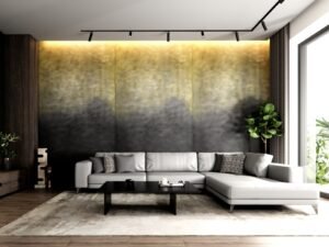
Textured Finishes and Decorative Plaster
Textured finishes like Venetian plaster, limewash, or soft plaster create tactile and visual depth. They catch light subtly, adding dimension and richness to any room. Textured walls are excellent luxury wall finishes because they make plain spaces feel curated and expensive. They also highlight architectural details and pair beautifully with both natural and artificial lighting.
Accent Walls and Strategic Detail
Accent walls provide focus and personality without overwhelming a space. Using deeper colors, patterns, or subtle textures defines a room’s focal point while maintaining balance. Proper placement ensures the space feels both intimate and expansive. Accent walls are also one of the most practical paint and finish tips for luxury interiors, elevating design effortlessly.
Layered and Complementary Tones

Layered tones involve pairing a primary wall color with complementary trims, moldings, or secondary shades. This approach adds depth, creates cohesion, and emphasizes architectural elements. It also allows for seamless transitions between furniture, flooring, and decor. Layered tones are an innovative technique for homeowners looking to combine expensive paint colors and wall finishes with modern wall design ideas.
Common Mistakes That Undercut a High-End Look
Overly Bright or Clashing Colors
Walls painted in colors that are too vibrant or poorly matched to furniture create visual chaos, making a space feel cheap rather than luxurious.
Flat or Excessively Glossy Finishes
A completely flat finish can appear dull, while overly glossy walls reflect light harshly, both undermining the perc
Ignoring Undertones
Undertones affect how a color reacts to lighting. Failing to consider them can result in walls that clash with adjacent finishes or decor.
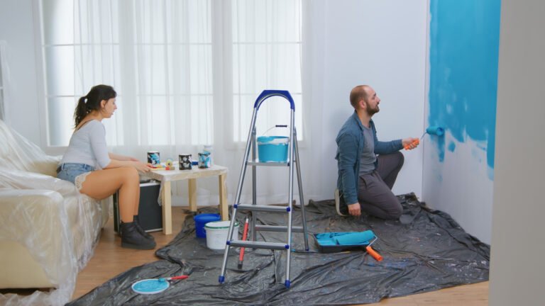
Incorrect Application
Uneven coats, streaks, or visible brush marks make even expensive paint colors and wall finishes look sloppy. Proper prep and technique are crucial.
Neglecting Room Lighting
Walls that look great in a showroom can appear off in your own space if natural and artificial light isn’t considered, affecting mood and perceived size.
Quick Wall Paint and Finish Checklist
Test Swatches in Multiple Lights
Paint samples should be observed under daylight, warm light, and artificial light to ensure accurate color perception.
Match Finish to Room Function
Matte for cozy areas, satin or eggshell for high-traffic zones, choosing the right finish balances aesthetics and durability.
Coordinate with Existing Elements
Ensure wall colors complement furniture, flooring, and decor to create a cohesive and expansive feel.
Plan Accent or Feature Walls
Use richer colors or textures on focal walls, but keep them balanced with surrounding tones to avoid overpowering the room.
Consider Layered Tones
Pairing primary colors with complementary trims or moldings adds depth and sophistication, enhancing upscale wall finish techniques and luxury wall finishes ideas.
Conclusion
With careful planning and attention to detail, you can avoid mistakes that make walls feel cheap and embrace expensive paint colors and wall finishes that exude sophistication. Following our interior wall styling tips ensures rooms feel balanced, polished, and expansive. At HomeChisel, we provide tools, guides, and expert advice to help you choose the right colors and finishes for your space. Contact us today to bring your high-end vision to life.